Charts of the Week
If re-elected, Donald Trump promises to once again reduce tax rates. He is asserting the resulting boost to growth will more than pay for the lost revenue. However, tax rates as a percentage of GDP have been remarkably stable at around 20% in the post-WW II era. This is despite a maximum marginal tax rate that has been as high as 90% and as low as 28%.
As these pages have often noted, the International Energy Agency (IEA) has persistently underestimated global oil demand for many years. Thus, it’s odd that it is projecting very strong consumption for both this year’s second and third quarter. It begs the question of whether it is attempting to provide cover for the Biden administration (Joe Biden remains in the Oval Office… for now) to release yet more oil from the Strategic Petroleum Reserve (SPR) in order to drive down gasoline prices prior to November.
“Everyone’s fully invested in U.S. exceptionalism. A bond investor is overweight U.S. Treasurys. An equity investor is massively long U.S. stocks and massively long U.S. tech stocks, and everyone’s now overweight the dollar. And I just wonder if this is the thing that we’re going to get wrong.” -BofA’s Chief Investment Strategist and Managing Director, Michael Hartnett
For this issue of Making Hay Monday (MHM), we thought readers might want to receive an update of our break-out charts edition. Undoubtedly, we’ve beaten you over the head with what we feel is one of the best ways to make profits on both a near-term and longer-term basis: identifying stocks experiencing what investing legend John Paul Tudor Jones calls range expansions. As this is a special, chart-centric edition, we will not be running our usual asset-class lists, nor the Contender and DFTC sections. All of that will return in our July 29th edition!
The basic idea is that when a stock has been in a long-defined range of, say, $20 - $40, and it breaks out clearly to the upside, it is sending a powerful signal that further appreciation is probable. By the way, the inverse is true on the downside. Selling out of breakdowns below multi-year support levels is a highly effective way of avoiding investment black holes, especially those stocks at risk of going to zero, or something in that wealth-destroying vicinity.
This has happened all too frequently, particularly with financial stocks – see Credit Suisse, SVB Bank, First Republic Bank, and Signature Bank, all last year. The Great Recession also saw several of America’s biggest financial institutions essentially wiped out. Those included Citigroup, AIG, Fannie Mae, Freddie Mac, Washington Mutual, and Lehman Brothers. (Only Citi dodged a complete annihilation but its stock price hit $1 at the worst, before a massive reverse split). Had one paid attention to multi-year support levels, tremendous pain could have been avoided.
Two weeks ago, we reviewed over 225 charts of stocks that were potential break-out candidates. In some cases, they hadn’t quite achieved that status. In others, the upside range expansion happened a number of months ago and the stocks had already run up substantially after shattering resistance. Consequently, those were removed. (Note: resistance is on the upside and support is at the low end of a long-term range; in both cases, longer is better and we’ve found a trading range that has persisted for at least three years is a minimum. However, as we’ve previously written, the longer the range has been in place, the more meaningful the break-out or breakdown.)
That left about 70 names, a still too-unwieldy number of stocks for the purposes of this MHM. As a result, we narrowed this down to 10. However, for those who’d like to see the full list, you’ll find contact information at the end of today’s edition to which you can send a request. This offer is for paying customers only, of course. In fact, we’re only sharing the first two ETF ideas with those who have yet to upgrade to paid-subscription status. (If you do appreciate and find actionable value in our weekly offerings, we hope you’ll consider supporting us by upgrading today.)
As you will soon see, we’ve provided some brief commentary on the stocks that made the second cut. This is not to say that there aren’t some extremely intriguing stocks among the remaining 60.
Let’s get to it.
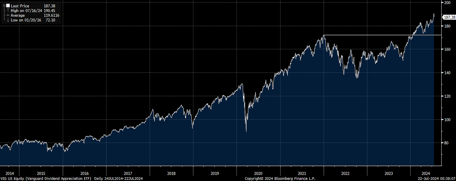
VIG
The first two highlights are very similar in that they are ETFs comprised of “Dividend Aristocrat-type” securities. In prior MHMs, we’ve pointed out that going back for the last 30 years or more, these have materially outperformed the S&P 500. However, over the last decade it’s been the opposite outcome.
VYM
Since 7/11/2014, the S&P has returned 236% versus 193% and 152%, respectively, for the Vanguard Dividend Appreciation Index Fund ETF (VIG) and the Vanguard High Dividend Index Fund ETF (VYM). The reason VIG has done far better than VYM – or, said differently, has performed much less poorly – is, unsurprisingly, because it has had considerably more tech exposure. Of course, it hasn’t had enough of a technology allocation to keep up with the increasingly tech- and consumer discretionary*-concentrated S&P. It’s been our contention that the Dividend Aristocrat stocks are likely to meaningfully outperform their generally lower yielding and lower quality peers. The beautiful break-outs revealed in the charts shown below strongly suggest that these elite entities are on the verge of seriously out-legging the overall stock market.
*This is primarily due to Amazon’s massive weighting in that sector.


