Look Out Above!
In The Ring - May 13th, 2022
Source: ClipSafari.com
“Credible forward guidance means market interest rates have increased substantially in advance of tangible Fed action. By this second definition of ‘behind the curve’, the Fed is not as far behind, but it must now increase the policy rate to ratify the forward guidance previously given.” -James Bullard, St. Louis Fed President (emphasis added).
What is the most important financial chart in the world right now? According to some leading strategists, it’s the trendline of the yield peaks on 10-year U.S. treasury-notes since that pivotal year of Y2K. Coincidentally, or not, that was when the last mega-bubble in tech stocks met its maker. As you can see below, it has produced an ominous signal lately.
Figure 1
However, through the Haymaker’s market lens, the critical threshold isn’t around 3% but somewhat (admittedly, not much) higher. As a reminder, one of our most important analytical techniques relates to long-term trading ranges. The longer these have been in place, the more meaningful is the breakout, or breakdown, from this band.
On a breaking below basis, note from Figure 1 above that when the T-note yield low of around 1.5%, that had held for about 10 years, was busted to the downside during the 2020 pandemic panic, the next stop was roughly 0.5%. In other words, that was a strong advance signal that rates were headed materially lower.
In the case of Figure 1, it is tracking an interest rate not a price, though a similar conclusion could be reached by looking at the price of the 10-year T-note. To examine this situation from that angle, please review the following visual. You can see the major upside price breakout that occurred in 2020, as yields tumbled to the lowest in U.S. bond market history. Figure 2
Somehow, it seems appropriate to place the 10-year T-note into a 10-year historical context. But, in our extensive experience with trading ranges, the three-year mark is where we find actionable signals. As I noted above, though, the longer the range has been in place, the more valuable, and actionable, the message. Consequently, if both a 3-year and 10-year range is violated, one way or the other, the more attention should be paid to this development.
On that basis, referring back to Figure 1, a yield of 3 ½%, if it is hit, becomes material as it would be a clear break above the peak set around 3.¼% in 2018. A sharp-eyed observer would point out that what happened in 2018 somewhat contradicts the importance of trading ranges. A higher yield peak than 3 ¼%, it could be argued, should have followed the penetration of the 2013 prior apex.
It’s a very valid comment and it illustrates that no single indicator is the end-all, be-all. However, rates did continue to work higher in 2018, for a while, just not much. It certainly wasn’t the most valuable technical signal the bond market ever produced.
As my EVA newsletter conveyed long before I began publishing as the Haymaker — and as I also explain in my book Bubble 3.0 — the best breakout signals are those that align with fundamental events. For example, with a stock, an upside breakout of a long-term trading band that coincides with accelerating earnings is a much more valuable signal than a range expansion on its own. It’s true that price action often precedes fundamental improvement; yet, in my experience, it’s best to have some confirmation of actual operating conditions becoming more positive, in the case of a stock.
When it comes to Fed tightening cycles, the reality is that the bond market often begins pricing those in even before our central bank starts elevating rates. As you can see from the following graphics, in 2004 and again in 2013, the Fed’s preceding two monetary squeeze plays, bond yields soared even prior to a single rate increase. (The arrows indicate the first rate hike of that cycle.)
Figure 3
In both cases, there were subsequent further yield rises, toward the end of the tightening phase, but those were minor compared to the earlier spikes. Actually, in 2015 longer-term bond yields fell for nearly a year and it took over two years for them to meaningfully exceed where they were at the time Janet Yellen first timidly raised rates.
Remarkably, her bump in 2015 was the Fed’s first rate increase in nine years and she waited a full year to nudge rates up another ¼% in December 2016. Ms. Yellen implemented three additional hikes in 2017, but the fed funds rate was still a mere 1 3/8% when she handed Jay Powell the Fed reins in January 2018. Mr. Powell tightened four more times in 2018 and convinced the world he was a long way from neutral that fall. A “long way” turned out to be… about 10 weeks. Powell then performed his legendary Powell Pivot in the face of stock market turbulence that hit a crescendo between Christmas and New Year’s Day 2018.
(As an important aside, the first-quantitative tightening — QT, the opposite of the now infamous QE series — began under Ms. Yellen in September 2017. It was Jay Powell, though, who would be at the helm as most of the Fed’s balance sheet shrinkage occurred. At first the stock market ignored the threat from this double-tightening–raising rates and shrinking its balance sheet–but by late December 2018 it was in full-blown panic mode, as noted above.)
Based on this history, and also of the 2004 to 2007 episode, one could reasonably assert that the bond market does a lot of the heavy lifting for the Fed and that the final yield pop, after the Fed has jacked rates up multiple times, is kind of a weak crescendo.
Note that the same process has played out again this year. The Fed didn’t initiate its first rate increase until March 16th and yet the bond market had already driven yields up by 0.70% (70 basis points) to 2.20%. This amounted to a nearly 50% yield increase. From the aforementioned bottom in 10-year T-note yields, in July 2020, at 0.55%, it was a four-fold move. Obviously, though, this was off of an absurdly low level.
Figure 4
But what’s different this time is that serious bond market carnage has continued to occur post the Fed’s first rate hike. As you can see in Figure 4, the yield on the 10-year T-note hit 3.20% last week, up almost a full percent (100 bps) from where it was when Powell & Co. at long last implemented its first rate increase since 2018. (It’s fair to observe that the severe stock weakness seen this week, which pushed the NASDAQ more than 30% below its early January peak, has catalyzed a mild T-note rally. As a result, its yield has eased back down to around 2.9%. The challenge is that if stocks rally, yields will likely surge again, putting renewed pressure on equities.)
Why has this time proven different for the bond market? Well, this CNBC quote following Powell’s press conference last week — in the wake of the meeting at which he hiked rates by ½% but blew off the idea of a ¾% jump — might be the key: “Powell moving expeditiously to control inflation.” Frankly, I thought it was the laugh line of the week, but it does speak to the difference versus past tightening cycles: In reality (a land free of CNBC-spin), his “expeditious” move was anything but.
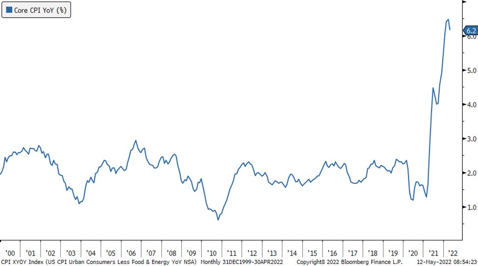
Back in 2004 and 2018, inflation was still in the 2% to 3% range, where it has been for most of this century/millennium, with a few brief forays above and below that zone. However, once again, the range expansion thesis sent an extremely prescient message that a new era was at hand in the spring of 2021. In this case, it involved macro-economic data, specifically inflation, versus market price action.
Figure 5
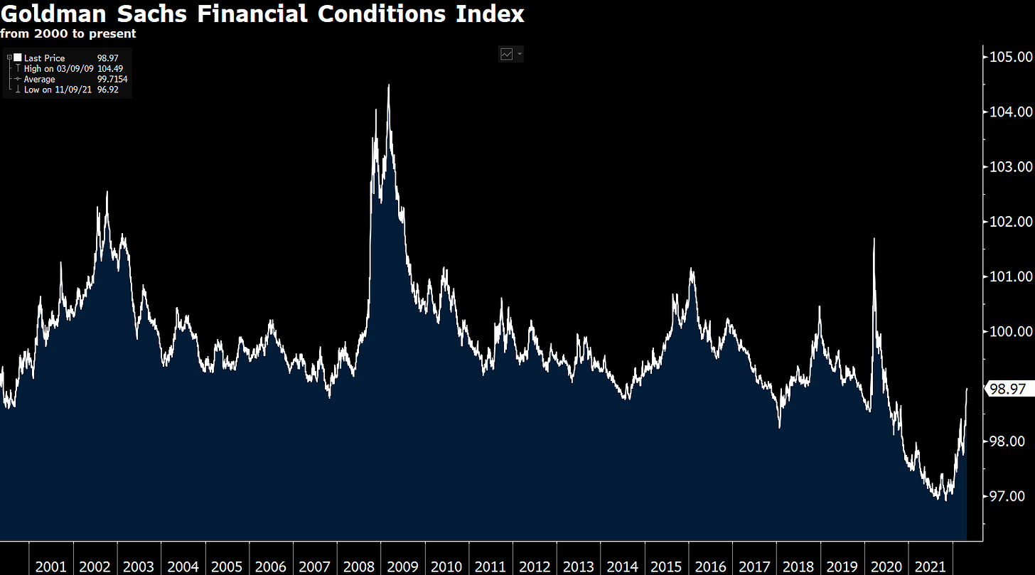
Here's another big difference. As you can see from the Goldman Sachs Financial Conditions Index, when the Fed first jacked rates in 2004, financial conditions were relatively tight, at least excluding the mini-credit crisis of 2002.
Figure 6
Sourced from Kevin Muir, The Macro Tourist
Figure 7
Sourced From Minack Advisers (Down Under Daily)
In late 2015, when Ms. Yellen hesitantly initiated that tightening cycle, they were very tight. (This is why she likely was on hold for the next year.) However, as you can see, today the GS Financial Conditions reading is actually extremely easy, excluding the Covid timeframe. This is also the case when comparing the U.S. to the rest of the world. In other words, the Fed’s got a very long way to go to achieve true tightness. This is disconcerting given that both the NASDAQ and the Russell 2000 Small Cap index were down around 30% from their recent peaks (in the case of the latter, it topped out in November) before the oversold bounce that began on Wednesday.
The bottom-line of this analysis is that treasury yields may have a decent amount further to go on the upside, despite their sharp pull-back over the last few days. A move to 4% is certainly not out of the question. With the CPI running around 8%, that would still be a negative yield of 4% after accounting for inflation. But, clearly, the stock market is feeling the heat from these higher rates and may experience a selling climax before the yield on the 10-year T-note gets that high.
These higher treasury rates have also ignited a fire under the otherwise questionably valuable U.S. dollar. As Richard “Urban Kaoboy” Kao said during a recent podcast with my great friend Grant Williams, the dollar is like a wrecking ball right now, slamming into almost every asset class on the planet. Even some parts of the energy sector are feeling its impact, though it remains up an astounding 41% this year.
Between rising rates and a soaring dollar, something has to give before long. But, in the meantime, when it comes to treasury yields, look out above. For almost everything else, look out below!
An Ask Of Our Subscribers
Haymaker has a lot of rounds ahead in what would be a very tough fight without you in our corner. You can back us up by tapping the heart and, even better (though we appreciate both), weighing in with a comment. If you haven’t done so, look for the intuitive shapes, and keep your favorite financial pugilist punching with all his might.
Okay, that’s the bell. We’re back at it.


So glad GW had you on. Really great article here!
Heard about this substack from the GW podcast, and glad I found it. Love the name and looking forward to more content!